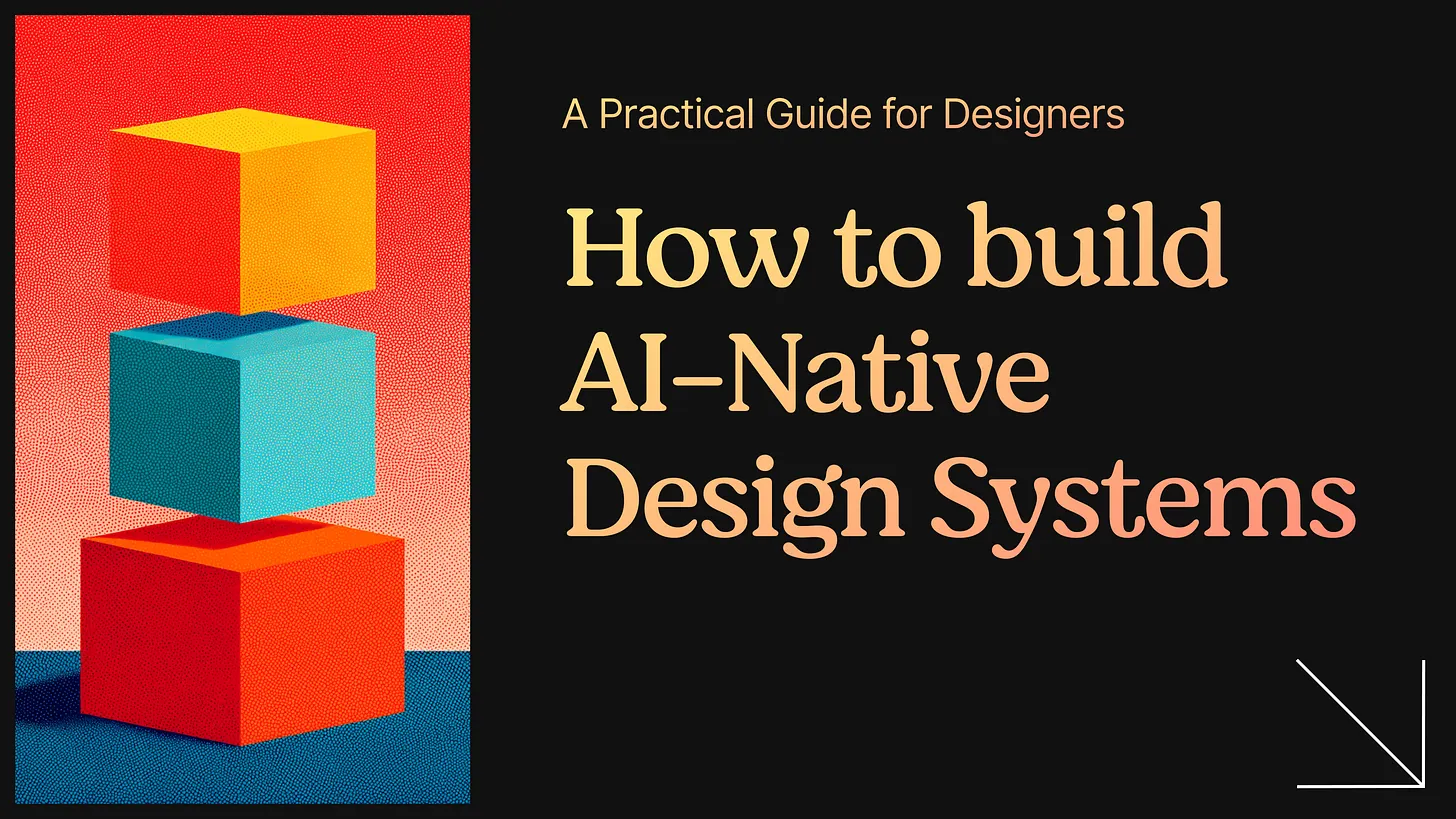
Taste Design
 google-labs-code5.1k
Generate premium, non-generic DESIGN.md guidelines for Stitch with strict anti-pattern bans, semantic design language, and responsive/motion constraints.
Install


Other agents
Paste this install command into ChatGPT, Claude, Gemini, or any other agent.
SKILL.md
---
name: taste-design
description: Generate premium, non-generic DESIGN.md files for Google Stitch using semantic design rules, explicit anti-pattern bans, and production-ready constraints.
---

# Stitch Design Taste - Semantic Design System Skill

## Overview

This skill generates `DESIGN.md` files optimized for Google Stitch screen generation. It translates anti-slop frontend engineering directives into Stitch's native semantic design language: descriptive, natural-language rules paired with precise values that Stitch's AI agent can interpret to produce premium, non-generic interfaces.

The generated `DESIGN.md` serves as the single source of truth for prompting Stitch to generate new screens that align with a curated, high-agency design language.

## Prerequisites

- Access to Google Stitch via https://labs.google.com/stitch
- Optional: Stitch MCP Server for integration with Cursor, Antigravity, or Gemini CLI

## The Goal

Generate a `DESIGN.md` file that encodes:

1. Visual atmosphere - mood, density, and design philosophy
2. Color calibration - neutrals, accents, and banned patterns with hex codes
3. Typographic architecture - font stacks, hierarchy, and anti-patterns
4. Component behaviors - buttons, cards, and inputs with interaction states
5. Layout principles - grid systems, spacing philosophy, responsive strategy
6. Motion philosophy - animation specs, spring physics, micro-interactions
7. Anti-patterns - explicit list of banned AI design cliches

## Analysis and Synthesis Instructions

### 1. Define the Atmosphere

Evaluate the target project's intent. Use evocative adjectives from this taste spectrum:

- Density: "Art Gallery Airy" (1-3) -> "Daily App Balanced" (4-7) -> "Cockpit Dense" (8-10)
- Variance: "Predictable Symmetric" (1-3) -> "Offset Asymmetric" (4-7) -> "Artsy Chaotic" (8-10)
- Motion: "Static Restrained" (1-3) -> "Fluid CSS" (4-7) -> "Cinematic Choreography" (8-10)

Default baseline: Creativity 9, Variance 8, Motion 6, Density 5. Adapt dynamically based on user vibe.

### 2. Map the Color Palette

For each color provide: descriptive name + hex code + functional role.

Mandatory constraints:

- Maximum 1 accent color; saturation below 80%
- "AI purple/blue neon" aesthetic is banned (no purple glows, no neon gradients)
- Use neutral bases (Zinc/Slate) with high-contrast singular accents
- Keep one palette throughout; avoid warm/cool gray shifts
- Never use pure black (`#000000`); use off-black, Zinc-950, or charcoal

### 3. Establish Typography Rules

- Display/headlines: track-tight, controlled scale, hierarchy through weight and color
- Body: relaxed leading, max 65 characters per line
- `Inter` is banned in premium/creative contexts; prefer `Geist`, `Outfit`, `Cabinet Grotesk`, or `Satoshi`
- Generic serif fonts (`Times New Roman`, `Georgia`, `Garamond`, `Palatino`) are banned
- If serif is needed for editorial/creative contexts, use only modern serifs: `Fraunces`, `Gambarino`, `Editorial New`, `Instrument Serif`
- Serif is always banned in dashboards/software UIs
- Dashboard pairings: `Geist` + `Geist Mono` or `Satoshi` + `JetBrains Mono`
- High-density override: if density > 7, all numbers must use monospace

### 4. Define the Hero Section

The hero must be creative, striking, and never generic:

- Inline image typography: embed small contextual visuals between words at type-height
- No overlapping: text must never overlap text or images
- No filler copy: ban "Scroll to explore", "Swipe down", chevrons, bounce prompts
- Asymmetric structure: centered hero layouts are banned when variance > 4
- CTA restraint: maximum one primary CTA, no secondary "Learn more"

### 5. Describe Component Stylings

For each component type, define shape, color, shadow depth, and interaction behavior:

- Buttons: tactile active feedback; no neon glows; no custom mouse cursors
- Cards: only when elevation communicates hierarchy; tint shadows to background hue
- High-density layouts: replace cards with border-top dividers or negative space
- Inputs/forms: label above input, helper text optional, errors below
- Loading: skeletal loaders matching real layout dimensions (no generic spinners)
- Empty states: composed guidance on how to populate data
- Error states: clear inline reporting

### 6. Define Layout Principles

- No overlapping elements or absolute-positioned content stacking
- Centered hero sections are banned when variance > 4
- "3 equal cards horizontally" is banned; use zig-zag, asymmetry, or horizontal scroll
- Prefer CSS Grid over Flexbox percentage math; avoid `calc()` hacks
- Constrain layout with max-width containers (for example, 1400px)
- Use `min-h-[100dvh]` for full-height sections; avoid `h-screen`

### 7. Define Responsive Rules

- Mobile-first collapse (< 768px): all multi-column layouts become single column
- No horizontal overflow on mobile
- Headline scaling via `clamp()`; body text minimum `1rem`/`14px`
- Interactive targets minimum `44px`
- Inline typography images stack below headline on mobile
- Desktop nav must collapse into clean mobile navigation
- Reduce vertical spacing proportionally: `clamp(3rem, 8vw, 6rem)`

### 8. Encode Motion Philosophy

- Spring defaults: `stiffness: 100, damping: 20`; no linear easing
- Perpetual micro-interactions on active components (pulse, typewriter, float, shimmer)
- Staggered orchestration for list reveals; avoid instant mounts
- Animate only `transform` and `opacity`; never animate geometry properties

### 9. List Anti-Patterns (AI Tells)

Encode these as explicit "NEVER DO" rules in `DESIGN.md`:

- No emojis
- No `Inter`
- No generic serif fonts
- No pure black (`#000000`)
- No neon or outer glow shadows
- No oversaturated accents
- No heavy gradient text on large headers
- No custom mouse cursors
- No overlapping elements
- No 3-column equal card layouts
- No generic names ("John Doe", "Acme", "Nexus")
- No fabricated numbers, metrics, or performance statistics
- No fake "system metrics" sections with invented data
- No `LABEL // YEAR` formatting conventions
- No AI copywriting cliches ("Elevate", "Seamless", "Unleash", "Next-Gen")
- No filler prompt text ("Scroll to explore", "Swipe down", arrows)
- No broken Unsplash links; use `picsum.photos` or SVG avatars

## Output Format (`DESIGN.md` Structure)

```markdown
# Design System: [Project Title]

## 1. Visual Theme & Atmosphere
(Evocative description of mood, density, variance, motion intensity.)

## 2. Color Palette & Roles
- **Canvas White** (#F9FAFB) - Primary background
- **Pure Surface** (#FFFFFF) - Card/container fill
- **Charcoal Ink** (#18181B) - Primary text
- **Muted Steel** (#71717A) - Secondary text
- **Whisper Border** (rgba(226,232,240,0.5)) - Structural lines
- **[Accent Name]** (#XXXXXX) - Single accent

## 3. Typography Rules
- **Display:** [Font Name] - Track-tight hierarchy
- **Body:** [Font Name] - Relaxed leading, 65ch max-width
- **Mono:** [Font Name] - Code/metadata/high-density numbers
- **Banned:** Inter, generic system fonts in premium contexts

## 4. Component Stylings
- **Buttons:** Flat, tactile active state, no outer glow
- **Cards:** Rounded, soft shadow, hierarchy-driven use
- **Inputs:** Label above, error below, accent focus ring
- **Loaders:** Skeletal shimmer
- **Empty States:** Composed guidance

## 5. Layout Principles
(Grid-first responsive architecture, asymmetric hero structures, max-width containment.)

## 6. Motion & Interaction
(Spring physics, staggered reveal, perpetual micro-loops, transform/opacity-only animation.)

## 7. Anti-Patterns (Banned)
(No emojis, no Inter, no pure black, no neon glows, no generic AI filler conventions.)
```

## Best Practices

- Be descriptive: "Deep Charcoal Ink (#18181B)" over "dark text"
- Be functional: explain what each token does
- Be consistent: use stable naming language
- Be precise: include concrete values
- Be opinionated: enforce a clear premium aesthetic

## Common Pitfalls

- Using only technical jargon without design translation
- Omitting hex codes or functional roles
- Being too vague about atmosphere
- Ignoring anti-patterns and drifting to generic outputs