
Claude vs ChatGPT: A Deep Dive into Composer Design Philosophy
Same technology, different visions. How ChatGPT and Claude's interface choices reveal competing philosophies about AI's future.
Claude and ChatGPT are two widely used consumer AI products with overlapping use cases (chat, writing, coding, analysis). But when you use both, the interaction model can feel different, not only because of model behavior, but because each product makes different UX choices about what’s visible, what’s configurable, and what the “default” workflow is.
This article focuses on one high-leverage surface: the composer (the input area and its surrounding controls). The goal isn’t to declare a winner, it’s to map design tradeoffs you can reuse when building your own AI product.
Note: consumer AI products evolve quickly. The observations here describe the UI patterns shown in the embedded examples at the time of writing.
The Composer: More Than an Input Box
Both products center around a composer, the interface where you type prompts and the AI responds. But the composer experience can emphasize different things.
ChatGPT’s composer often acts like a control surface for choosing how you want the system to respond (modes/capabilities/tools). Think of it as a command center.
Claude’s composer often emphasizes what context the assistant should use (attachments, sources, workspace state) with fewer explicit mode decisions in the primary flow. Think of it as a conversation space optimized for depth.
Neither approach is inherently better; they optimize for different user needs and product constraints.
Tool Switching: Discoverability vs. Cognitive Load
ChatGPT: Capability-first navigation
ChatGPT exposes a menu of capabilities and modes directly from the composer. This supports discoverability: users can browse what’s available without memorizing commands. It also supports intent clarity: users can signal “I’m researching” vs. “I’m generating an image” up front.
.png)
ChatGPT's tool selection dropdown showing GPTs, Think mode, Research mode, and other specialized capabilities
View Example →The pattern is hierarchical, primary tools in the main dropdown, with nested menus for deeper options like image generation templates.
.png)
Image tool selected with contextual templates for different use cases
View Example →Tradeoffs: strong discoverability and explicit intent, but more up-front decisions and higher risk of “which option do I pick?” moments for casual users.
Claude: Context-first workflow
Claude’s default composer flow tends to stay simpler and puts more emphasis on adding and managing inputs (files, sources, context chips). Rather than asking users to pick a mode, it often encourages “describe what you need” and “add the relevant context.”
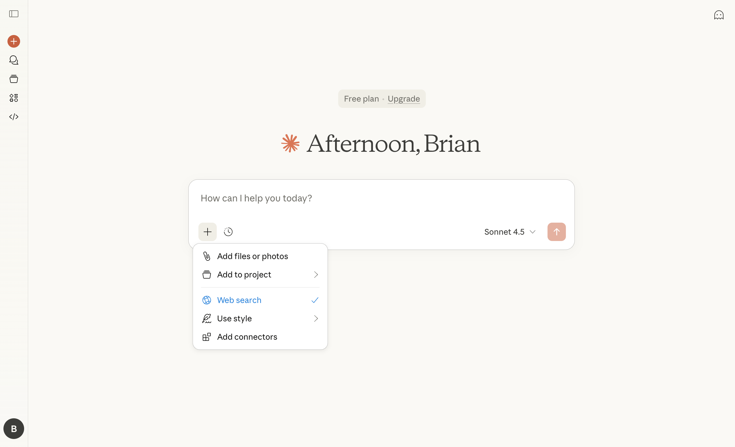
Claude's minimalist composer with plus (+) icon for adding context sources and managing tools
View Example →The emphasis is on input enrichment, not capability selection. Users add context (via chips for documents/URLs) and manage active tools as dismissible chips, keeping the workspace clean.
.png)
Adding context sources via menu with removable chips for clean workspace management
View Example →Tradeoffs: fewer up-front decisions and a cleaner default UI, but potentially less discoverable capabilities and less certainty about what the system will do under the hood.
A useful framing is explicit routing vs. implicit routing: some products ask users to help route (“choose a tool/mode”), while others route based on the request and provided context (with escape hatches when the guess is wrong).
Behind the scenes, these choices often change some combination of the underlying model, tool access/permissions, system instructions, latency/cost, and safety constraints, so the core UX question is how explicitly you want to surface those tradeoffs.
Model/Capability Selection: Explicit Labels vs. Bundled Experiences
ChatGPT: Modes that bundle behavior and capability
ChatGPT frequently uses mode labels that communicate intent (e.g., “Research”, “Study”, “Think”). These can be helpful, but they may not always be transparent about which underlying model, tool access, or system behavior changes with a selection.
Design implication: mode names can be great UX, but they work best when users also have a clear mental model of what changes (latency, cost, tool use, citations/browsing, etc.).
Claude: Task-oriented model selection
Claude surfaces model selection with labels oriented around task fit (e.g., “everyday tasks” vs. “complex work”). This can reduce model literacy requirements: users choose based on outcomes, not technical specs.
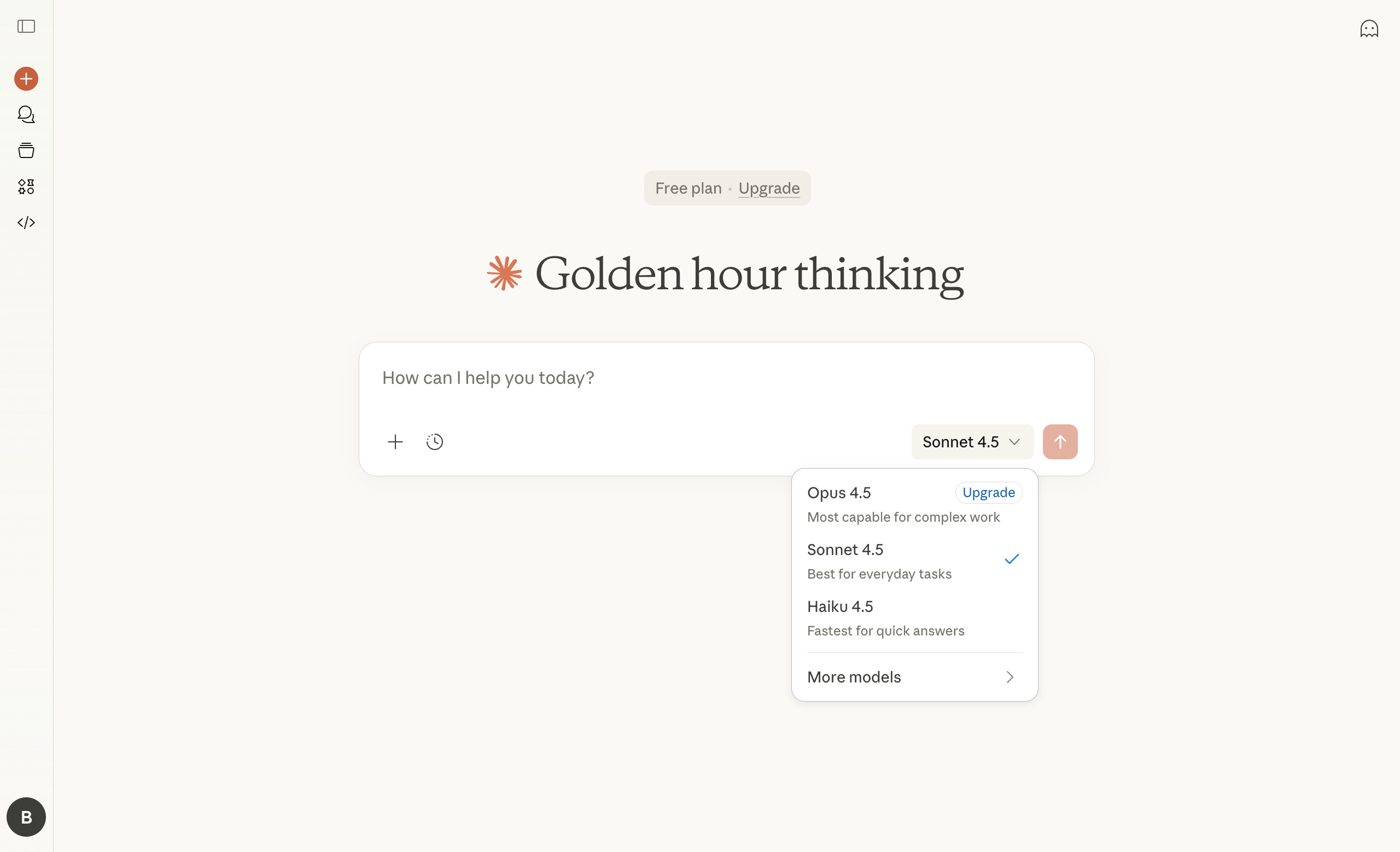
Claude's task-oriented model selection: Opus (complex work), Sonnet (everyday tasks), Haiku (quick answers)
View Example →Progressive disclosure keeps it clean: primary options visible, with a “More models” submenu for legacy versions.
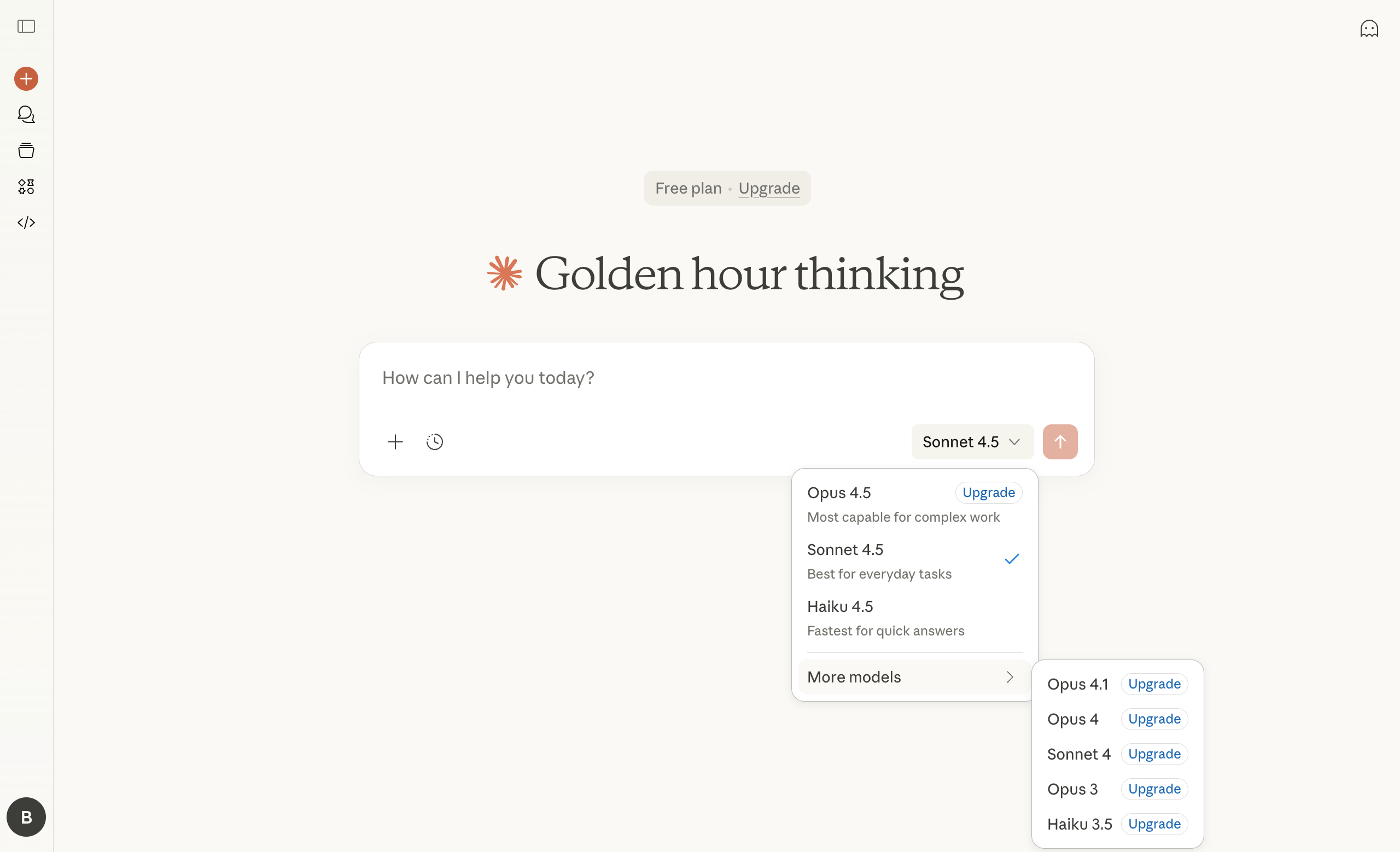
Expanded 'More models' submenu revealing legacy model versions with upgrade prompts
View Example →Design implication: task-based labels can make selection approachable, but they still require guidance (what changes: latency, depth, cost, tool access, etc.).
What These Differences Might Signal (Interpretation, Not Fact)
These UX choices can be interpreted as different product bets: one direction optimizes for breadth and feature discoverability, while the other optimizes for depth and workflow continuity. Many products eventually converge, adding explicit controls for power users while keeping the default flow simple.
ChatGPT: Breadth & discoverability (one possible reading)
ChatGPT’s mode/tool surfacing and ecosystem features can make it feel like a platform where multiple capabilities and integrations coexist.
Potential strengths: discoverability, flexibility, extensibility, multiple workflows in one place
Potential challenges: complexity creep, decision overhead, maintaining coherence as capabilities multiply
Claude: Depth & workflow continuity (one possible reading)
Claude’s emphasis on context management, natural language personalization, and task-oriented model labels can make it feel like a workspace optimized for continuity and depth.
Potential strengths: lower cognitive load, consistent default flow, strong context UX, approachable selection cues
Potential challenges: less discoverable capabilities, fewer explicit power-user controls, fewer integrations depending on the ecosystem
Design Lessons for AI Products
If you're building an AI product, the Claude vs. ChatGPT comparison surfaces critical questions:
1. Should users choose capabilities or should AI infer them?
A capability-first UI says: Show the menu, let users decide.
A context-first UI says: Let users describe the need, route intelligently.
The answer depends on your users. Power users often tolerate complexity for control. Mainstream users often want results without repeated decisions, as long as the system remains predictable and provides escape hatches.
2. How transparent should model/capability selection be?
Task-based labels trade technical precision for usability. Mode labels communicate purpose, but still require users to understand when to use what, and what actually changes behind the scenes.
Transparency builds trust, but too much complexity erodes accessibility. Find the abstraction level that matches your audience's expertise.
3. Is personalization a feature or a foundation?
Personalization is rarely binary, it’s a spectrum. It can range from lightweight preferences (tone, formatting, defaults) to deeper identity/memory/workflows (goals, projects, tools, teammates).
Claude makes personalization feel foundational because it’s always shaping the assistant. ChatGPT often surfaces it as an optional layer among many settings. That difference is largely an experience choice: how prominently the product exposes “who I am” and “how I like to work.”
The right bet depends on your retention mechanics:
- Long-horizon assistants (creative work, knowledge work, recurring projects): treat personalization as core UX infrastructure (easy capture, visibility, control, and reset).
- Transactional/task tools: keep personalization low-friction and bounded (strong defaults + quick per-task overrides) so it doesn’t slow completion or increase risk.
To make personalization work in practice, design for the constraints: users need to understand what’s remembered and why (trust), be able to override it quickly (control), and recover when it makes the wrong assumption (failure modes like “ignore preferences” or “reset”).
Conclusion
The composer is a high-leverage surface: it quietly determines whether your product feels like a toolbox, a workspace, or a conversational partner.
In practice, teams are balancing two interaction models:
- Capability-first: the composer as an app switcher (iOS-style)
- Context-first: the composer as a personalized workspace (text editor-style)
Neither is “right”, they’re solving for different use cases. The right design depends on your users, your feature set, and how much decision-making you want to push to the UI versus the system.
The patterns both products are evolving, tool switching, model/capability selection UI, context management, and personalization, are building blocks most AI products will need to get right.
Explore these patterns in the gallery
Found this useful? Share it with your network.
Weekly insights in your inbox
A weekly newsletter for designers, PMs, and builders shipping AI products. Practical AI UX: patterns, real products, no hype.